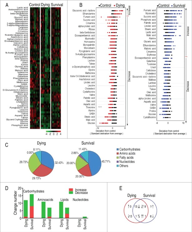
Figure 2.

Differential metabolomic profiling between dying and survival groups in response to V. alginolyticus infection compared with control. A, Heat map showing differential metabolites. Green color and red color indicate increase and decrease of metabolites relative to the median metabolite level, respectively (see color scale). B, Z-score plot of differential metabolites based on control. The data of dying (left) and survival (right) groups were separately scaled to the mean and standard deviation of control. Each point represents one metabolite in one technical repeat and colored by sample types. C, Category of identified metabolites of differential abundance. D, Number of differential abundance of metabolites. E, Venn diagram for comparison of differential metabolites between the dying and survival groups.
