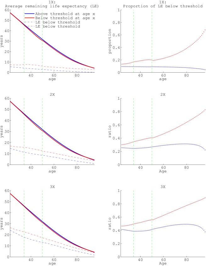
Fig 4. The average remaining life expectancies and remaining years in poverty.
Average remaining life expectancies (solid lines) and expected years in poverty (dashed lines) conditional on surviving to age x based on state at age x (red = below threshold, blue = above threshold). a, c, and e, differ in the threshold income used to define poverty, 1×, 2×, and 3× the ‘official’ poverty income level, respectively. The ratio of the average remaining life in poverty (or below 2× poverty or 3× the ‘official’ poverty threshold) to total average remaining life are graphed in panels (b), (d) and (f). In other words, this is the proportion of average remaining life below a specified threshold. All values are calculated from the fundamental matrix (see section B of S1 Theory). The dashed green vertical lines in each panel are the seams between data-sets utilized: NLSY79 pre-1994, NLSY79 post-1994 and HRS (at age 33 and 50).

