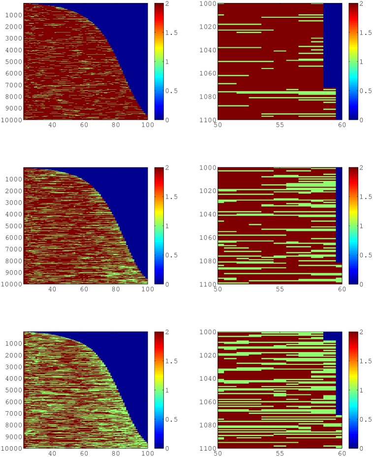
Fig 6. Cohort simulations of 10,000 individuals lifetime trajectories.
The right column is a ‘snapshot’ of 100 individuals between the ages of 50 and 60 with mortality around 60. Red is the above income threshold state, green is below the income threshold, and blue is death. The first column is the entire cohort and is in the shape of a survivorship curve for all three rows. The first row of panels has a threshold at 1× poverty income threshold, second row is 2× and third row is 3× poverty income threshold.

