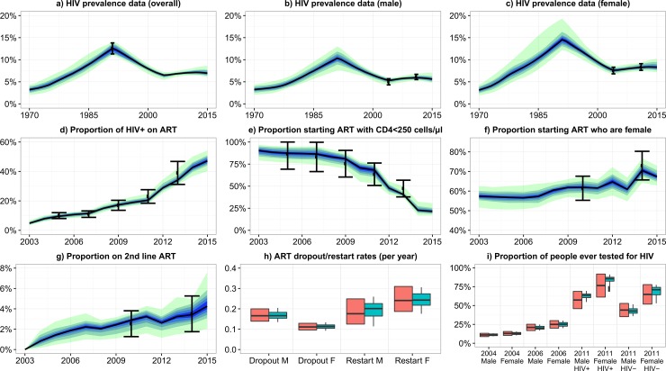
Fig 1. Model baseline fit to empirical data.
Graphs a-g: Black dots show the empirical estimates, and the error bars show the plausible ranges for the output values. Black lines show the median model output. Blue/green bands show 10% quantiles of model outputs, from the 100 model fits. The full width of the band shows the range of the model output. Graphs h-i: Orange boxes show the empirical data and plausible ranges. Green boxes show the model output. Model fits to the remaining 20 outcomes are show in McCreesh et al[11].

