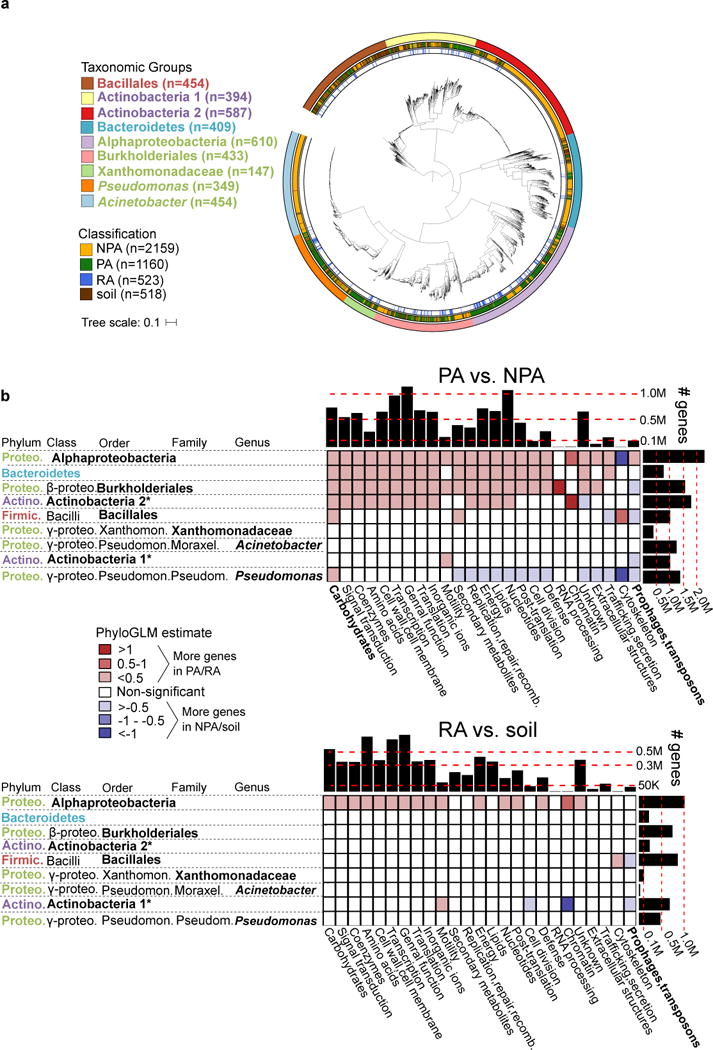
Figure 1. Genome dataset used in analysis and differences in gene category abundances.

a. Maximum likelihood phylogenetic tree of 3837 high quality and non-redundant bacterial genomes based on the concatenated alignment of 31 single copy genes. Outer ring denotes the taxonomic group, central ring denotes the isolation source, and inner ring denotes the RA genomes within PA genomes. Taxon names are color-coded based on phylum: green – Proteobacteria, red – Firmicutes, blue – Bacteroidetes, purple - Actinobacteria. See URLs for ITOL interactive phylogenetic tree. b. Differences in gene categories between PA/NPA (top panel) and RA/soil (bottom panel) genomes of the same taxon. For both panels, the heat map indicates the level of enrichment or depletion based on a PhyloGLM test. Significant (colored) cells have p value < 0.05, FDR corrected. Hot colored cells indicate significantly more genes in PA and RA genomes in the upper and lower panels, respectively. Histograms on the upper and right margins represent the total number of genes compared in each column and row, respectively. PA – plant-associated, NPA – non-plant associated, RA – root associated, soil – soil-associated. * not a formal class name. Carbohydrates – Carbohydrate metabolism and transport gene category. Full COG category names from the X axis appear in Supplementary Table 6. Note that cells with high absolute estimate values (dark colors) are based on categories of few genes and are therefore more likely to be less accurate.
