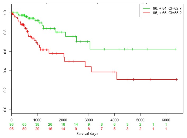
Figure 6.
Kaplan-Meier curves for high- and low-risk groups, represented with red and green curves respectively, of a cervical cancer dataset in the SurvExpress database. Censored samples are marked with ‘+’. The red and green numbers on the x-axis represent the number of mortalities of high- and low-risk individuals, respectively, occurring prior to the end of follow-up. The number of samples, censored number and CI are displayed in the top-right insets. The red and green numbers below the x-axis represent the number of low- and high-risk patients alive. CI, concordance index.

