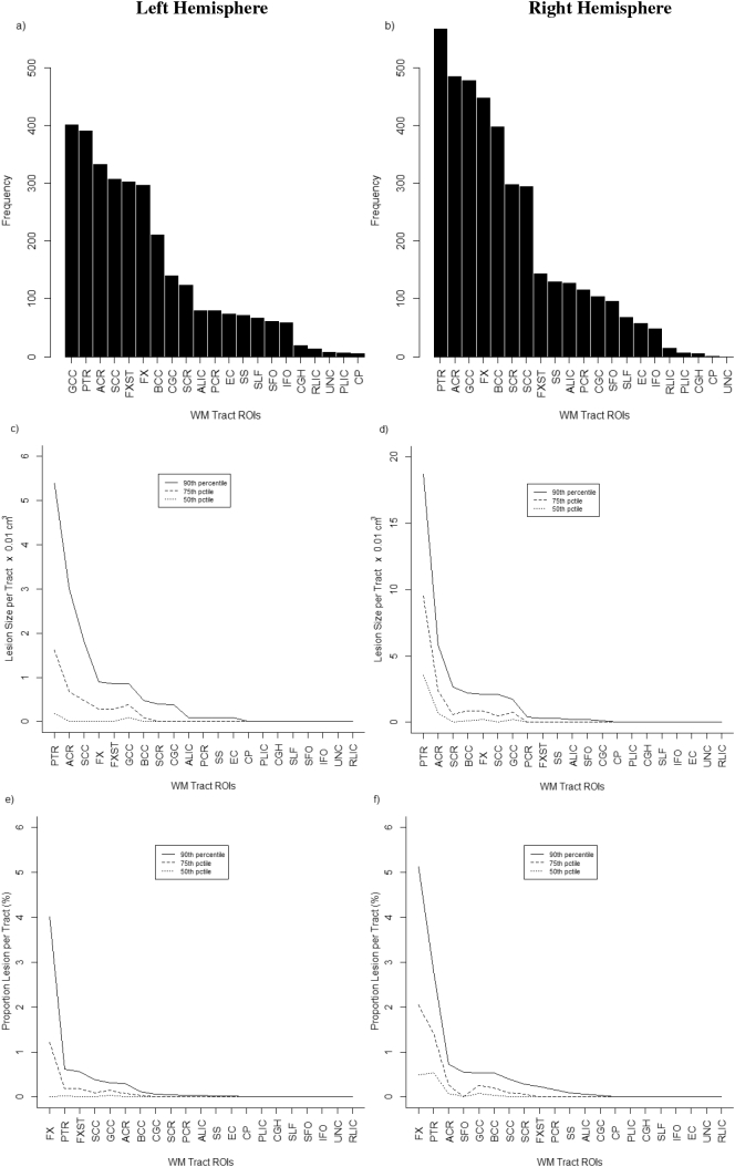
Fig. 1.
Distribution of WML for different WM tracts in left hemisphere (plots a, c, e) and right hemisphere (plots b, d, f) based on frequency, absolute lesion volume, and relative lesion volume (as % of total tract volume). A full description of WM tract ROIs is provided in Supplemental Table 1. Supplemental Table 2 includes numeric results of ordered ROIs that correspond with the plots where tracts with highest to lowest values of each metric (e.g. WML volume) are shown.

