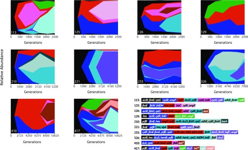
Fig. 2.
Muller plots representing relative abundances of haplotypes over 3 y of evolution. Shades of green, red, and blue denote different haplotypes, with variation in shade both within the figure and the mutation legend representing new variants arising within these haplotypes. Mutations in black occurred and fixed within populations before divergence of subpopulations. Relative abundances of haplotypes were inferred via whole-population sequencing performed every 6 mo, combining with whole-genome sequencing of eight individual clones from each population revealed haplotype associations. Numbers in the legend correspond to a particular population, while mutations included in the legend are present for at least two sampling points at a frequency of <0.05 in the population. Datasets S1 and S2 contain a complete list of mutations identified in each isolated clone.

