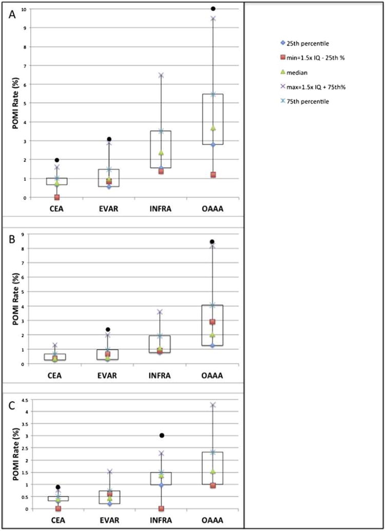
Fig. 3.

Box and whisker plot of (A) overall, (B) troponin only, and (C) clinical/ECG POMI rates by procedure. Each black circle represents a unique VQI region outlier with a POMI rate >1.5 interquartile lengths beyond the 75th percentile of distribution.
