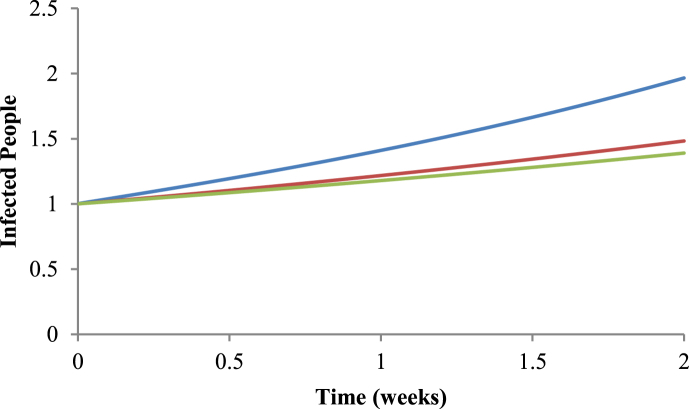
Fig. 5.
Comparison between the three methods. The blue line represents the number of infected people using R0=5.44 given by the Ross-Macdonald model (Macdonald, 1952); the red line represents the number of infected people using R0=3.11 given by the Nishiura method (2010); and in the green line represents the number of infected people using R0=2.67 given by the White & Pagano method (2008), for the period of 2009–2010.

