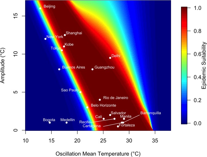
Fig 4. Variation in epidemic suitability across different seasonal temperature regimes.
The heat map shows the epidemic suitability (represented as the proportion of the total human population infected during an epidemic) as a function of mean annual temperature and temperature range. Here, temperature range is defined as the seasonal variation about the annual mean temperature. Twenty large, globally important cities are plotted to illustrate their epidemic suitability.

