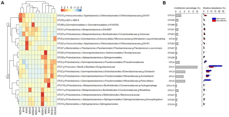
FIGURE 8.

Heatmap showing the relative abundance of the top 20 OTUs with percentage contributions greater than 0.5% to generate community dissimilarity between dam-controlled and dam-affected sites (A) and their percentage contributions and relative abundance (B). The colors represent changes in the relative abundance, and follow the color-code used in (A). Two major clusters were observed, as indicated by ① and ② in the tree. In (B), a straight line inside the box indicates the median of the values, while a solid circle indicates the mean; the box indicates the 25 and 75% percentiles of the values; the whiskers indicate the maximum and minimum of the values.
