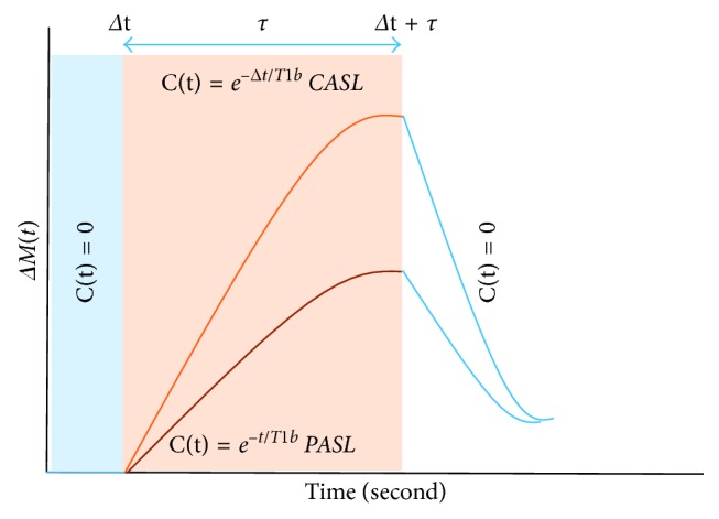
Figure 3.

General kinetic model curve illustrating the difference in the delivery bolus C(t) between CASL and PASL. Where the uppermost curve represents the CASL, and the lower curve represents the PASL. Respectively, the blue, red, and light blue boxes represent the different part of the general kinetic model.
