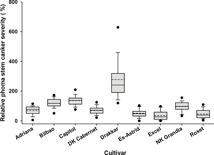
Fig 2. Distribution of relative phoma stem canker severity.
The distribution of relative phoma stem canker severity for each cultivar from winter oilseed rape field experiments at 13 sites in three growing seasons (2010/11, 2011/12 and 2012/13). Each box-plot shows the mean (broken line) and median (solid line) percentage relative phoma stem canker severity. The lower and upper boundaries of the boxes indicate relative phoma stem canker severity for the 25th and 75th percentiles, while whisker bars below and above each box indicate relative phoma stem canker severity for the 5th and 95th percentiles. The black dots below and above each box-plot represent the minimum and maximum relative phoma stem canker severities, respectively.

