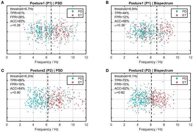
Figure 6.
Scatter plots of dominant frequency distribution comparing the PD cohort and the ET cohort in different cases. Horizontal axis indicates frequency and the vertical dotted line indicates the optimal frequency threshold between the two cohorts. (A) Under the PSD estimate with Posture 1 (P1). (B) Under the bispectrum estimate with Posture 1 (P1). (C) Under the PSD estimate with Posture 2 (P2). (D) Under the bispectrum estimate with Posture 2 (P2).

