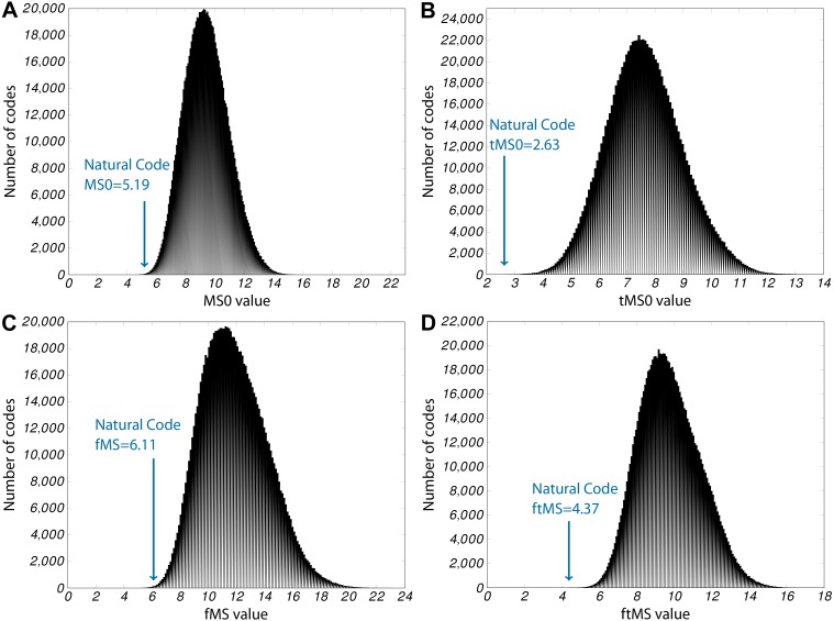
Figure 2. Histograms for the four principal errors measured.
In each plot, the x-axis shows the bins of the corresponding error values, y-axis gives the number of random codes that fall in this bin. In addition, the arrow in each plot shows the category into which the SGC falls. (A) MS0, 124 better codes found, P0 ≤ 10−3; (B) tMS0, 2 better codes found, Pt ≤ 10−5; (C) fMS, 267 better codes found, Pf ≤ 10−3; (D) ftMS, 0 better codes found, Pft ≤ 10−6

