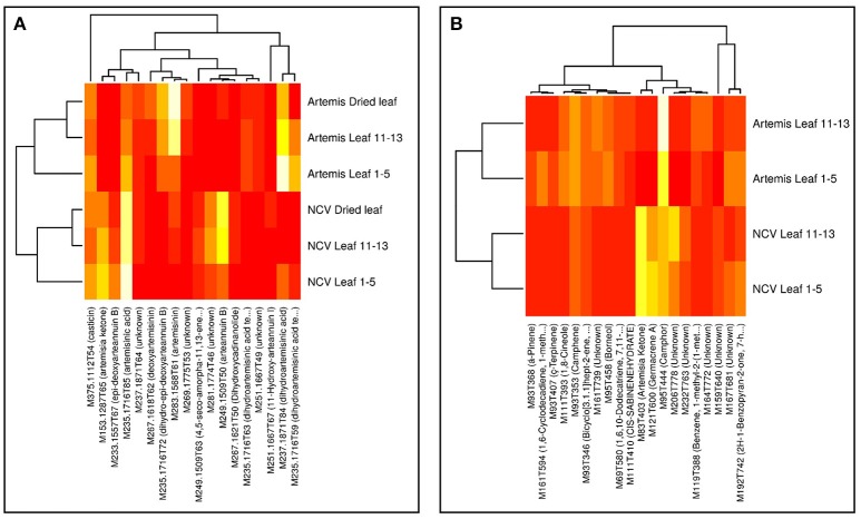
Figure 5.
Heatmaps of influential metabolites from UPLC- and GC-MS PCA analyses. Top-n [UPLC-MS = 18 (A); GC-MS = 20 (B)] metabolites were chosen for visualization based on loadings plots (Supplementary Figure 1) from the PC1 dimensions in the PCA analyses (Supplementary Figure 1). Mean data were log-scaled and then row-scaled for color intensity plotting (lighter = more abundant). Hierarchical clustering was performed with average linkage, with Euclidean distances for genotypes and 1-absolute values of correlations as distances for metabolites. Metabolite names are abbreviated where necessary for clarity and are given in full in Supplementary Tables 2, 3.

