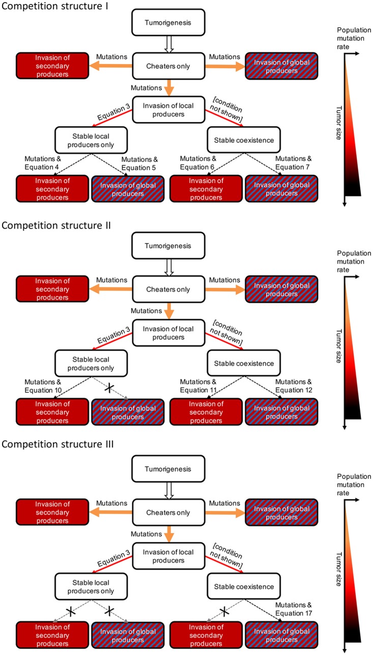
Fig 4. Schematic of possible tumor trajectories with their corresponding conditions.

The thicker the arrow, the easier the ecological conditions are met. Arrow colors correspond to the mutation rate according to the mutation gradient on the right. Crossed out arrows indicate resistance to invasion. Tumor size and population mutation rate increase going down the flowchart, as indicated by the graph on the right.
