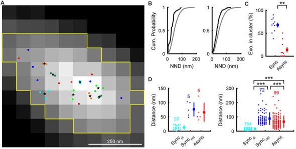
Figure 3.

Distribution of synchronous and asynchronous release locations in an AZLM. (A) Distribution of synchronous and asynchronous release locations in a representative AZLM. The AZLM area defined using the Otsu method was marked with yellow lines. Synchronous release events are categorized as those that occurred in clusters (marked with light blue, yellow green, dark green or orange circles) and those that occurred outside of any clusters (dark blue circles). Centers of individual cluster are marked with black stars. Asynchronous release locations are marked with red squares. (B) Cumulative probability plots of the nearest neighbor distances (NND) between synchronous release locations (black) and those obtained by Monte-Carlo simulation assuming random distribution (gray). The left graph shows data obtained from the AZLM shown in (A), and the right one shows averaged data from all AZLMs. (C) Ratios of synchronous (dark blue) or asynchronous (red) release events occurring in synchronous release clusters in each AZLM. Small circles represent percentages in respective AZLMs and a square and a bar represent mean and SEM. **p < 0.01, U-test. (D) Distribution of distances between each release location and the nearest center of a synchronous release cluster (light blue, synchronous release in a cluster; dark blue, synchronous release outside of any clusters; red, asynchronous release). The left graph shows data obtained from the AZLM shown in (A), and the right one shows data from all AZLMs. Small circles represent individual data and a square and a bar represent mean and SD, respectively. Numbers in the graph indicate the numbers of respective release locations. ***p < 0.001, U-test with Bonferroni correction.
