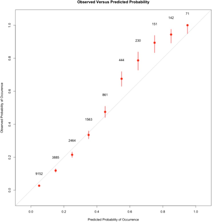
Figure 3.
Calibration plots of the Demographic/Physiologic/Lab RF model. The observed rate of death at 1 year within each one of the ten probability bins is plotted on the y-axis. The predicted probability from the RF model is indicated on the x-axis. The dotted diagonal line represents points along a perfectly calibrated model. Each point on the graph represents one of the ten bins of probability. The number beside each point represents the total number of hospitalizations that fall within the particular bin. The bars delineate the 95% confidence intervals around the observed probability.

