Figure 3.

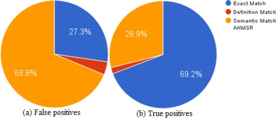
Sources of correct and incorrect predictions. Left chart shows percentage of false positives from each component (a) and the right chart shows true positive percentages (b).

Sources of correct and incorrect predictions. Left chart shows percentage of false positives from each component (a) and the right chart shows true positive percentages (b).