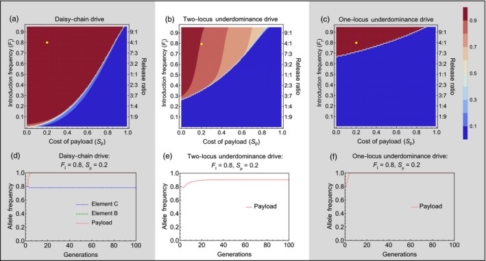
Figure 3.

Performance in isolated populations—Contour plots show the mean frequency of the payload allele in the 100 generations following a single introduction of engineered organisms, with color values given by the bar legend. The vertical axis shows the introduction frequency (FI) on the left side and the corresponding release ratio on the right side of each panel. Horizontal axis shows the homozygous cost of the payload allele. (a) Daisy‐chain drive, homing efficiency = 0.95; (b) Two‐locus underdominance and (c) One‐locus Underdominance. The yellow dot on each contour plot shows the conditions with which the time series plots (d, e & f) were generated
