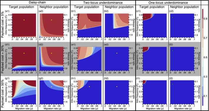
Figure 5.

Localization analysis with bidirectional migration—Contour plots show mean frequency of the payload allele in the first 100 generations in the two populations, after a single introduction of transgenics into the target population. The dots on the contour plots are shown to facilitate visual comparison between figures for different payload costs (Yellow dots for daisy‐chain and two‐locus underdominance correspond to FI = 0.7 and μ = 0.05; green dots for one‐locus underdominance corresponds to FI = 0.8 and μ = 0.02). Payload costs given for each row are the costs incurred by individuals homozygous for the payload transgene
