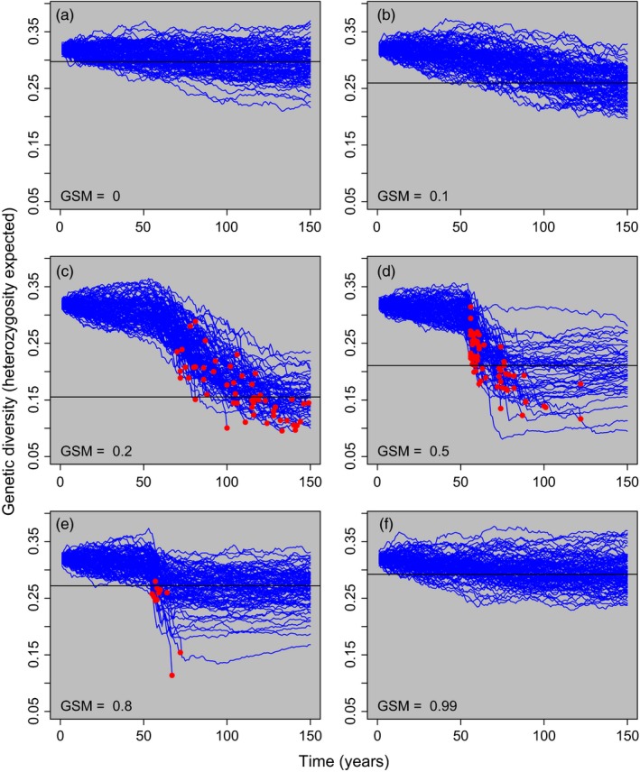
Figure 4.

Genetic diversity through time for six different values of genotype‐specific mortality (GSM; indicated in the bottom left of each panel). Each blue line represents a single model run. Bd was introduced into the population in year 50. Genetic diversity was measured as expected heterozygosity at the 100 neutral SNP loci. Red points highlight host populations that went extinct. The solid horizontal line in each panel indicates the median heterozygosity of populations that persisted for all 150 years. The populations illustrated in this figure are the same as those illustrated in Figure 3. Notice that the loss of genetic diversity is greatest in populations with intermediate GSM values
