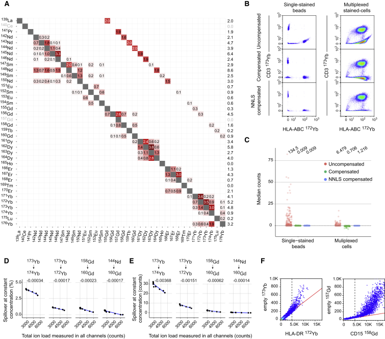
Figure 2.
Spillover Estimation and Current Limitations of Compensation due to Saturation Effects
(A) Spillover matrix calculated based on single-stained beads. Values on the diagonals are 1. By default, spillover is calculated only in potentially affected channels, which include M±1, those corresponding to known isotopic impurities, and M+16 (Figure S2D). Numbers in the cells indicate percentages of spillover by channels in rows into channels in columns. Numbers in the last column show the total amount of signal received in the corresponding channels.
(B) Scatterplots showing signal due to anti-HLA-ABC labeled with 172Yb and anti-CD3 labeled with 173Yb from pooled single-stained beads and multiplexed-stained PBMCs before and after compensation with standard flow cytometry methods (middle) and NNLS (bottom).
(C) Dot plots showing the median counts in each channel potentially affected by spillover for uncompensated data, compensated data, and NNLS-compensated data obtained upon analyses of single-stained beads and multiplexed-stained PBMCs. For multiplexed-staining, cells were stained with two panels where half of the channels were left empty, see (Table S1) to enable spillover assessment in absence of staining. For each dataset, the average sum of squares is shown on top of the graph.
(D) Dot plots showing the spillover in percent for the indicated relationships assessed on cells stained with increasing amount of barcoding reagents and identical antibody concentration. A linear model was fit to each relationship (blue lines), and the slope is indicated above each plot.
(E) Dot plots showing the spillover in absolute counts for the indicated relationships assessed on cells stained with increasing amount of barcoding reagents and identical antibody concentration.
(F) Scatter plot showing the relationship between the original signal and the most affected spillover channel for the indicated antibody-metal pairs on a linear scale. The dotted line and the red line show how the linear relationship is lost above 5,000 dual counts.

