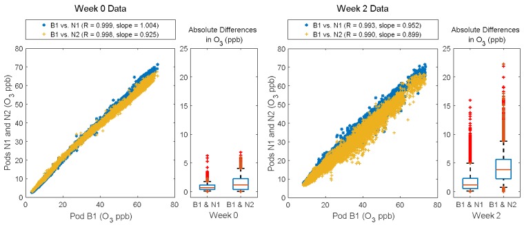
Figure 4.
Scatter plots showing each neighborhood Y-Pod (N1, and N2) vs. Y-Pod B1 for Weeks 0 and 2. The boxplots show the absolute differences between B1 and each of the neighborhood pods, with the whiskers at the 5th and 95th percentile respectively. The ozone sensor for N3 malfunctioned and the data was not included.

