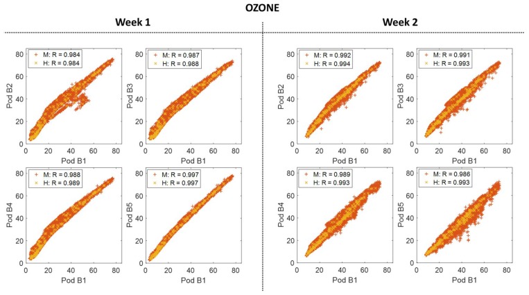
Figure 6.
The scatter plots to the left show the correlation between Y-Pod B1 and each of the added building Y-Pods (B2, B3, B4, and B5) for both minute (M) and hourly (H) O3 data for Week 1 (co-located). The scatter plots to the right show the same correlations, again with minute and hourly data, for Week 2 when they were spatially deployed around the building site.

