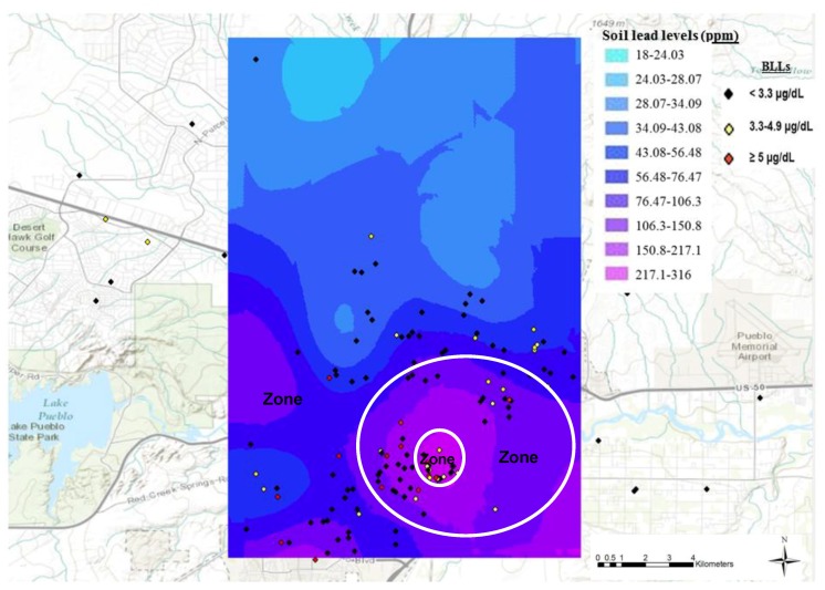
Figure 2.
Blood lead levels and geographical coordinates of children superimposed on the spatial soil lead distribution prediction map. All the data points in the figure represent the actual geo-physical locations of the 240 children who were tested for blood lead level during the current study in the summer of 2013; these data are not based on previous studies or prediction maps. Each dot represents the site where participating children lived. The black, yellow and red colors represent <3.3 µg/dL, 3.3–4.9 µg/dL and ≥5 µg/dL BLLs, respectively. The main smelter, the Colorado Smelter, was located in Zone 1 and the other smelters were located in Zone 2.

