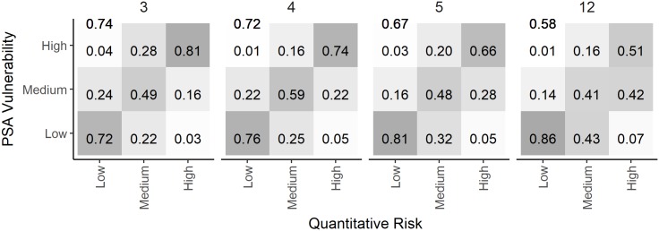
Fig 11. A comparisoin of the PSA risk ratings and the quantitative measure of risk calculated from different numbers of risk attributes.
Comparison of the PSA risk ratings and the quantitative measure of risk for 3 (rate of increase, selectivity, and discard mortality), 4 (previous plus steepness), 5 (previous plus encounterablity), and all 12 productivity and susceptibility attributes of the ePSA with high exploitation rate and B < 0.5 BMSY reference point. The values in each cell represent the fraction that the PSA assigned each risk category (y-axis) compared to the quantitative evaluation of risk (x-axis). Each column sums to one, and the values on the antidiagonal represent the true prediction rates for each risk category. The overall true prediction rate is shown in the top left corner of each plot.

