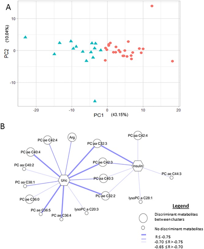
Fig 2. A. Scatter plot of cluster 1 (red dots) and cluster 2 (blue triangles) derived from K-means cluster analysis in the first (PC1) and second (PC2) principal components. B. Network of the correlations at T6–T0 of phenotype 1 between changes in uric acid (Uric) and fasting insulin (Insulin) and metabolites is represented.
Only correlations with statistical significance and corrected by false-discovery rate are drawn. The most discriminant metabolites between clusters (correlation with PCA r > 0.75 or r < -0.75) are represented by a big circle, and other metabolites by a small circle. Correlations r ≤-0.75 are represented by a thick line, correlations -0.70 ≤ r > -0.75 are represented by a medium line and -0.65 ≤ r > -0.70 by a thin line. Arg: arginine, PC aa: diacyl phosphatidylcholines, PC ae: acyl-alkyl phosphatidylcholines, and lysoPC: lysophosphatidylcholines.

