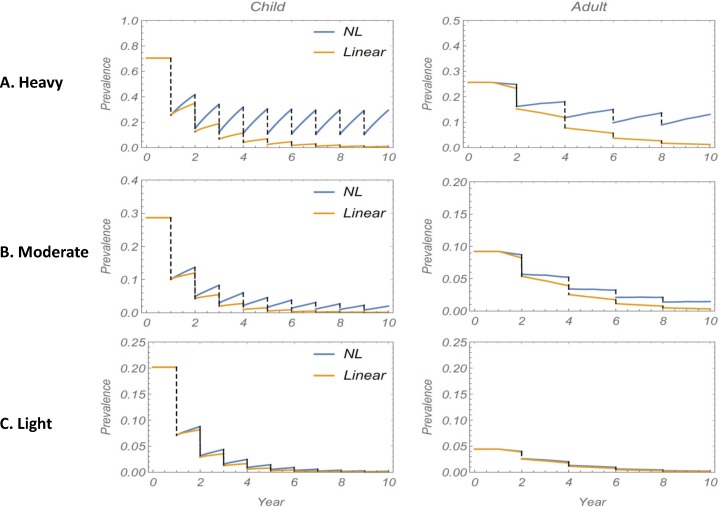
Fig 6. Comparison between M1 and M2 projections for a 10-year MDA regimen in three classes of transmission community.
The three plots (A)-(C) show the difference between using a linear (M1) vs. a non-linear (M2) snail FOI input in simulations of MDA program prevalence outcomes in high transmission setting ((A), top panels), moderate transmission settings ((B), middle panels) or low transmission settings ((C), bottom panels) for children (left side graphs) and adults (right side graphs). M1 (linear, yellow lines) and M2 (NL, blue lines) projections diverge significantly in (A), but are very close in in low transmission settings (C), where both projections follow a similar decay pattern.

