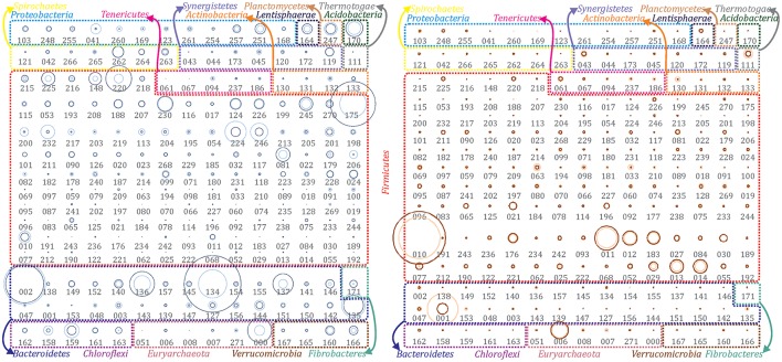
Figure 1.
Abundance of extracted population genomes. All the reconstructed PGs were illustrated for both temperature conditions to emphasize the differences among the two communities. PGs abundance in the mesophilic (left) and thermophilic (right) biogas microbial community has been represented as bubble graphs. Abundance before (light blue/red) and after (dark blue/red) H2 addition are represented as circles. The area size of each circle is proportional to the abundance of the corresponding PG. Taxonomic assignment at phylum level has been indicated using colored borders and coloring phyla names accordingly. Numbers below circles refer to the IDs of the corresponding PG (e.g., DTU000).

