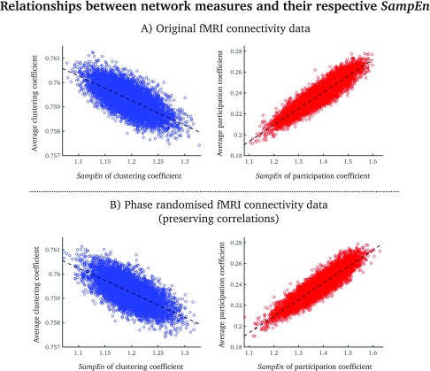
Figure 3. .
Scatterplots of average clustering coefficients (blue)/participation coefficients (red) and the SampEn of each network measure for the original fMRI data (A) and the phase-randomized fMRI data (B). Each point denotes a group-averaged node value. The dashed lines correspond to the best linear fit.

