Figure 2. Single cell analysis reveals tissue level differences in robustness of the clock.
(a), Rhythmic cell amplitudes in the imaged sections normalised to the amplitude of the mean trace (green line). Whiskers represent 9th and 91st percentile. (b), Between-cell and within-cell period variability in each imaged section. (c), Stochastic model CCA1 total molecule count for Ω = 1000 (top) and Ω = 100 (bottom) for 100 simulated runs (grey) plotted from 29 to 168 hr in constant light (comparable to the data in Figure 1). Means of all simulated runs are shown in red. Ω represents the system size. (d), Rhythmic simulated run amplitudes for different system sizes (Ω) normalised to the mean simulation (green line). (e), Between and within cell variability of each simulation with different system size. (f), Scatterplot of the rhythmic cells in all imaged plant sections stitched together. Colour indicates the maximum expression. (g), Scatterplot of the maximum expression values vs. longitudinal position on the plant measured from the root tip. Colour legend is the same as (f). For root tip, n = 242; lower root, n = 84; upper root, n = 46; lower hypocotyl, n = 114; upper hypocotyl, n = 53; cotyledon, n = 103 (n = number of rhythmic cells).

Figure 2—figure supplement 1. Tissue level differences in robustness synchronisation, and period of single cell clock oscillations in repeat WT experiment.

Figure 2—figure supplement 2. Tissue level differences in robustness, synchronisation, and period of single cell clock oscillations in CCA1-long experiment.

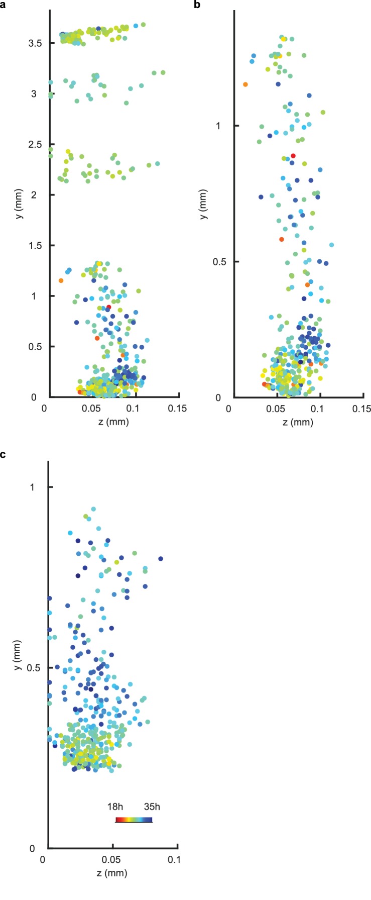
Figure 2—figure supplement 3. Periods display no spatial structure in z direction for WT repeat and CCA1-long experiments.