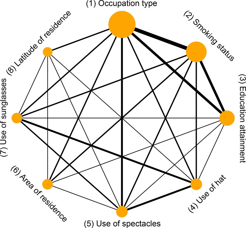
Figure 1.
Network plot of the pterygium data. The nodes represent the risk factors, and the edge between two nodes indicate that these nodes are simultaneously reported in common studies. The node size is proportional to the number of studies that report the corresponding risk factor, and the edge thickness is proportional to the number of studies that simultaneously report the corresponding two risk factors.

