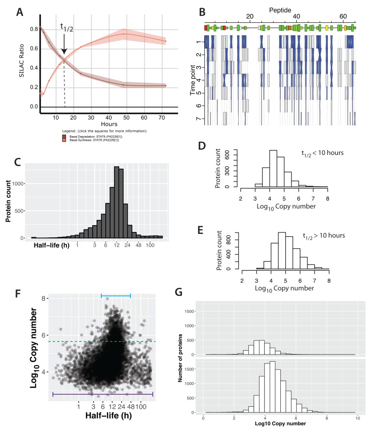
Figure 6. Protein half-lives in a contact-inhibited epithelial cell monolayer.
( A) A plot showing the synthesis (red) and degradation (brown) curves for STAT6. The lines and ribbons show the mean ratios and standard errors, respectively, from three biological replicates. The half-life point is indicated with an arrow. ( B) A ‘carrot’ plot showing the per-peptide analysis of half-life. The x-axis is peptide number (ordered by sequence position). Size of the box indicates the intensity for the peptide and the colour indicates the correlation between the individual peptide half-life versus the mean aggregate half-life for the protein (green – high correlation, red – low correlation). The y-axis is time and the hourglass shapes represent individual ratio measurements, with centre widths indicating standard error, and end widths and blue shading indicating the mean ratio across three biological replicates. Grey boxes indicate single replicate measurements. ( C) The distribution of half-lives measured in the basal state. ( D, E) The distribution of protein abundance for proteins that have either half-lives > 10 hrs ( D) or half-lives < 10 hrs ( E). ( F) A plot of log 10 copy number versus half-life (x-axis is log 2 space). The bars illustrate the range of half-lives for the highest and lowest copy number proteins. ( G) Copy number distributions for proteins whose half-lives could not be determined (top) versus proteins whose half-lives were measured (bottom).

