
Figure 1.
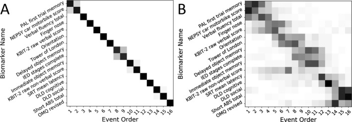
Positional variance diagrams show the maximum likelihood event sequence. Each entry represents the proportion of samples with each biomarker in each position ranging from 0 in white to 1 in black. (A) Positional variance diagram of the Markov chain Monte Carlo samples generated during fitting of the event‐based model (B) diagram of the samples generated during bootstrapping of the model.