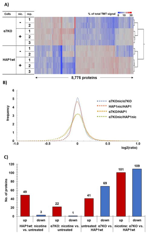
Figure 2. Protein abundance changes among cell lines and treatment.
A) The heat maps and associated dendrograms for each cell line and treatment. Across each row of the heat map, the relative protein expression levels are displayed, such that each row sums to 100. The scale corresponds to the percentage of total signal across all channels. B) Probability density function-smoothed histogram of protein alterations between α7KO+nicotine versus α7KO (untreated) (blue), HAP1wt+nicotine versus HAP1wt (untreated) (orange), α7KO (untreated) versus HAP1wt (untreated) (yellow), and α7KO+nicotine versus HAP1wt+nicotine (green). C) Bar chart representing significantly altered proteins in the different comparison groups within the TMT10-plex.

