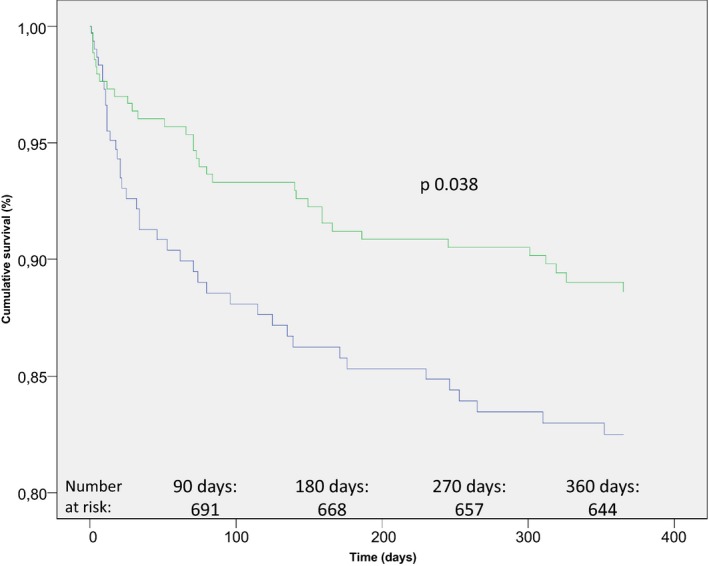
Figure 1.

Kaplan–Meier plot displaying percentage of survivors after twelve months, stratified by increase or decrease in systolic blood pressure (SBP). The blue graph represents patients with an increase in systolic blood pressure (SBP) on arrival to the stroke ward, when compared to the admission blood pressure at the emergency room. The green graph represents patients with a corresponding decrease in SBP. Age, sex, National Institutes of Health Stroke Scale (NIHSS) score in the acute setting, congestive heart failure, diabetes mellitus (type 1 and type 2), SBP, and history of ischemic stroke (IS) were used as covariates
