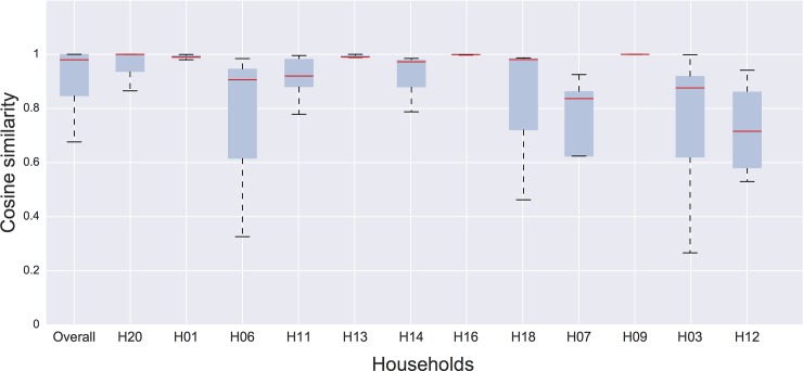
Fig 5. Distribution of cosine similarity measured for each node of the full contact network (overall) and for each single household.
Distributions are obtained by measuring the cosine similarity of each node's neighbourhood, for each pair of days of data collection. The box and whisker plots show the interquartile range, and the red line indicates the median value. The error bars extend from the box to the highest and lowest values. The households are ordered from left to right by increasing number of edges in the contact network.

