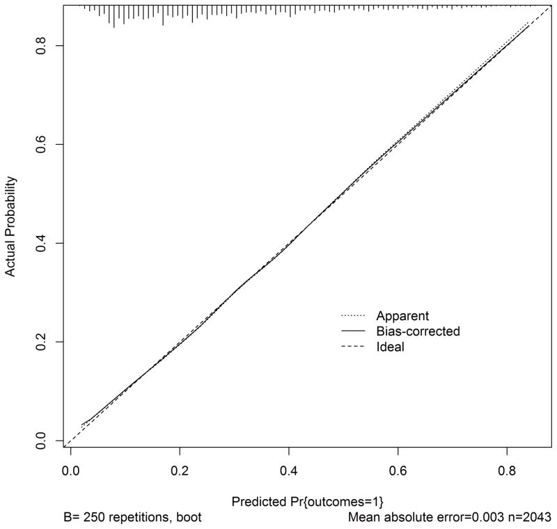
Figure 2.
Calibration of SNF prognosis score
The calibration plot demonstrates observed outcomes compared to expected outcomes across the range of probabilities; perfect calibration is demonstrated by the “Ideal” dotted line while our initial results are indicated by the “Apparent” line; “Bias-corrected” refers to the performance after bootstrap resampling.

