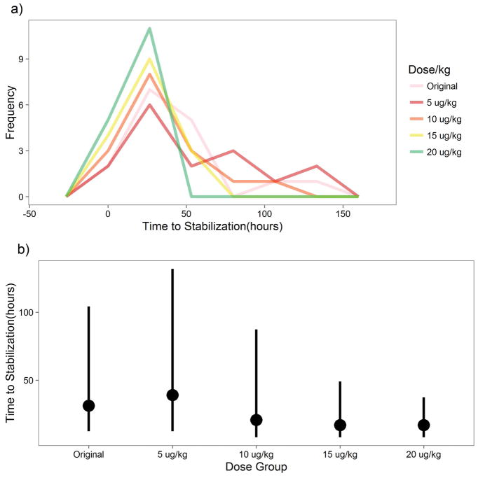
Figure 5.
NAS Dose Simulation. A) This is a frequency polygon plot representing the prediction of when each neonate would have stabilized if given a different dose relative to the original based on simulations from the PK-PD model. B) This point range plot shows the median and 95% confidence interval of time to stabilization by dose based on the PK-PD simulation. Here, “Original” refers to the dosing performed in the study.

