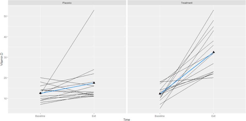
Fig. 1.
Spaghetti plot of 25 (OH) D (ng/ml) over the course of the trial by study groups (placebo and treatment) for all subjects. Each subject shown as a separate line. The blue lines represent the average trend in our data (For interpretation of the references to colour in this figure legend, the reader is referred to the web version of this article.)

