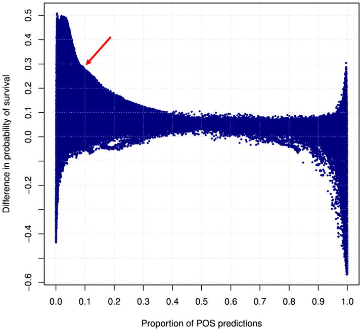
Figure 2.
A graph of relevant statistics for a large collection of SVM classifiers developed for the HCT donor selection application. Each dot represents a classifier, which labels donors as Preferred (or, equivalently, “POS”, for Positive) and NotPreferred (or, equivalently, “NEG”, for Negative). The x-axis is the proportion of donors labeled Preferred (i.e., “POS”) by the classifier. The y-axis is the survival benefit (difference in survival at 5 years) conferred by the donors, compared with survival of recipients who received HCT from NotPreferred donors. A clinically attractive classifier, selected for the validation, is labeled by red arrow. It is defined as the classifier which maximizes clinical benefit while labeling at least 10% of donors as Preferred.

