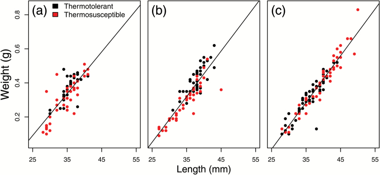
Figure 3.
Visualization of weight versus length relationships for each individual in family (a) D3, (b) D4, and (c) D5. Each dot represents an individual; dots are colored according to thermotolerance. A line of best fit is drawn through each distribution. Colors are viewable in the online version of the article.

