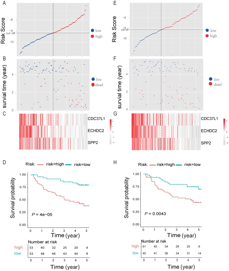
Figure 6.
Three-gene predictor-score analysis of HBV-associated HCC patients in both the discovery and internal cohort. (A) and (E) Three-gene risk score distribution in both the discovery (A) and internal testing cohort (E), respectively. Each point represents one patient; the vertical and horizontal axes represent the risk score calculated from the three-genes model and results sorted by the size of the risk score, respectively; red and blue represent patients with high and low risk scores identified by cut-off, respectively. The black dotted line represents the median mRNA risk score cut-off dividing patients into low-risk or high-risk groups. (B) and (F) Patients' survival status and time in both the discovery (B) and internal testing cohort (F), respectively. Each point corresponds to the same patient as above; the vertical and horizontal axes represent the survival time and results sorted by the size of the risk score, respectively; red or blue represent patient dead or live in the end, respectively. (C) and (G) Heatmap of gene expression profiles in both the discovery (C) and internal testing cohort (G), respectively. Each row represents the same gene and each column represents the same patient corresponded to the above point. The expression intensity of each gene in one patient is represented in shade of red or grey, indicating its expression level above or below the median expression intensity across all patients, respectively. (D) and (H) The Kaplan-Meier overall survival plots for HBV-associated HCC risk groups obtained from both the discovery (D) and internal testing cohort (H), respectively. Red and green line represent the patient with high or low risk, respectively.

