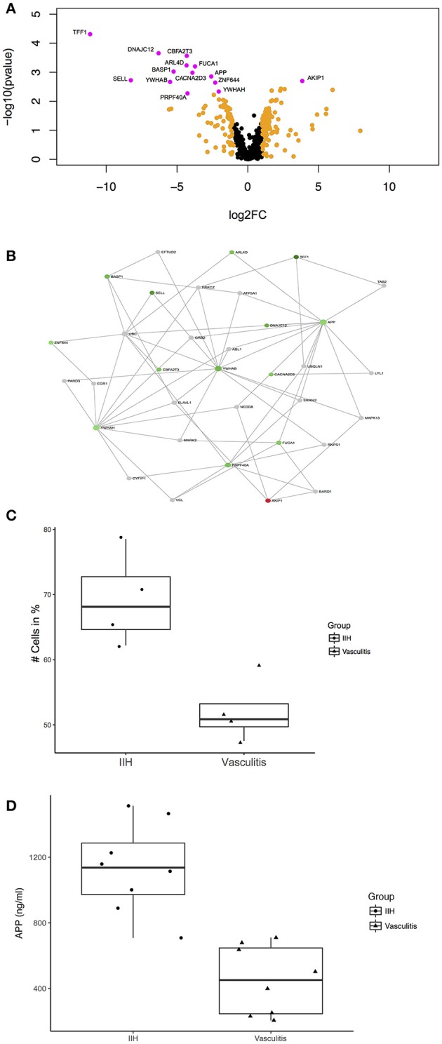
Figure 2.

Unbiased proteomics identifies proteins with differential abundance in CSF in PACNS. (A) Volcano plot showing all identified proteins and highlighting proteins with differential abundance. Proteins with log2(fold change) >1 are highlighted in orange and proteins with an adjusted p-value ≤ 0.05 and a log2(fold change) >1 are highlighted in magenta comparing PACNS vs. IIH samples. Names of proteins with significantly different abundance are provided in the figure. (B) Network of proteins with an adjusted p-value ≤ 0.05 built with NetworkAnalyst. The network shows the proteins identified in our LC-UDMSe analysis as well as proteins that directly interact with a given protein to study key nodes of functional connectivity. Red color indicates upregulated, green color downregulated proteins based on fold change. (C) Boxplot of the percentage of CD3+ T cells in peripheral blood for PACNS vs. IIH samples (p = 0.029). (D) Boxplot of the concentrations of APP in CSF of PACNS vs. IHH samples (p = 6.41E-05).
