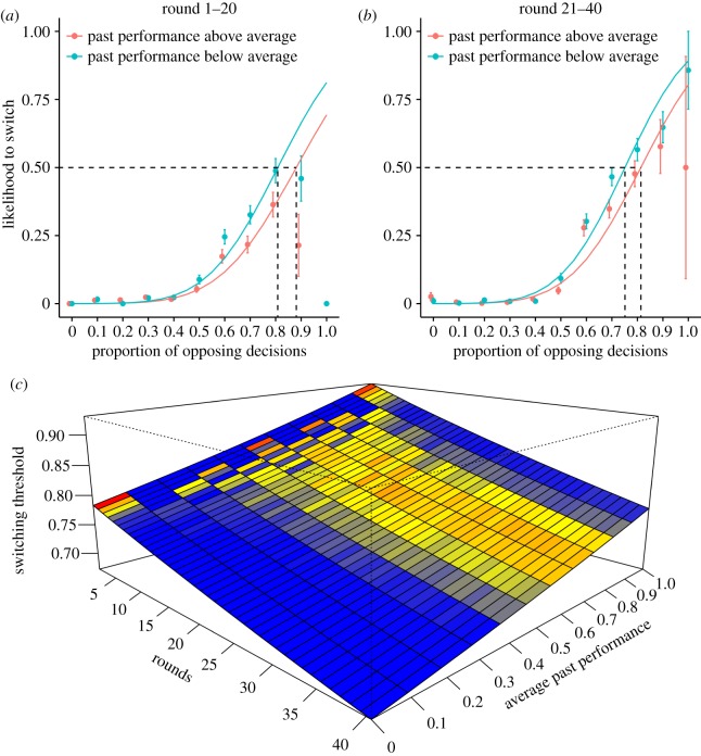
Figure 5.
(a,b) Relationship between the proportion of opposing decisions in the group and the individual likelihood of switching between poll 1 and poll 2 (i.e. after observing the social information) for (a) the first 20 rounds and (b) the last 20 rounds. Red lines represent individuals performing above the group average; blue lines represent individuals performing below the group average. Individuals generally followed a sigmoidal curve in reacting to the decisions of others. Switching thresholds were estimated as the proportion of opposing votes needed to induce a 50% likelihood of an individual changing its decision. The dashed lines indicate the switching thresholds for high- and low-performing individuals. Higher-performing individuals used higher switching thresholds, and switching thresholds decreased over the course of the experiment. Error bars represent standard error. Note that the proportions are binned for visualization purposes. (c) Relationship between the switching threshold, rounds and average past performance, with rounds and average past performance expressed on a continuous scale. The switching threshold decreased over time and was higher for high-performing individuals. Colours indicate the frequency of individuals, with blue indicating low frequency, yellow medium frequency and red high frequency.

