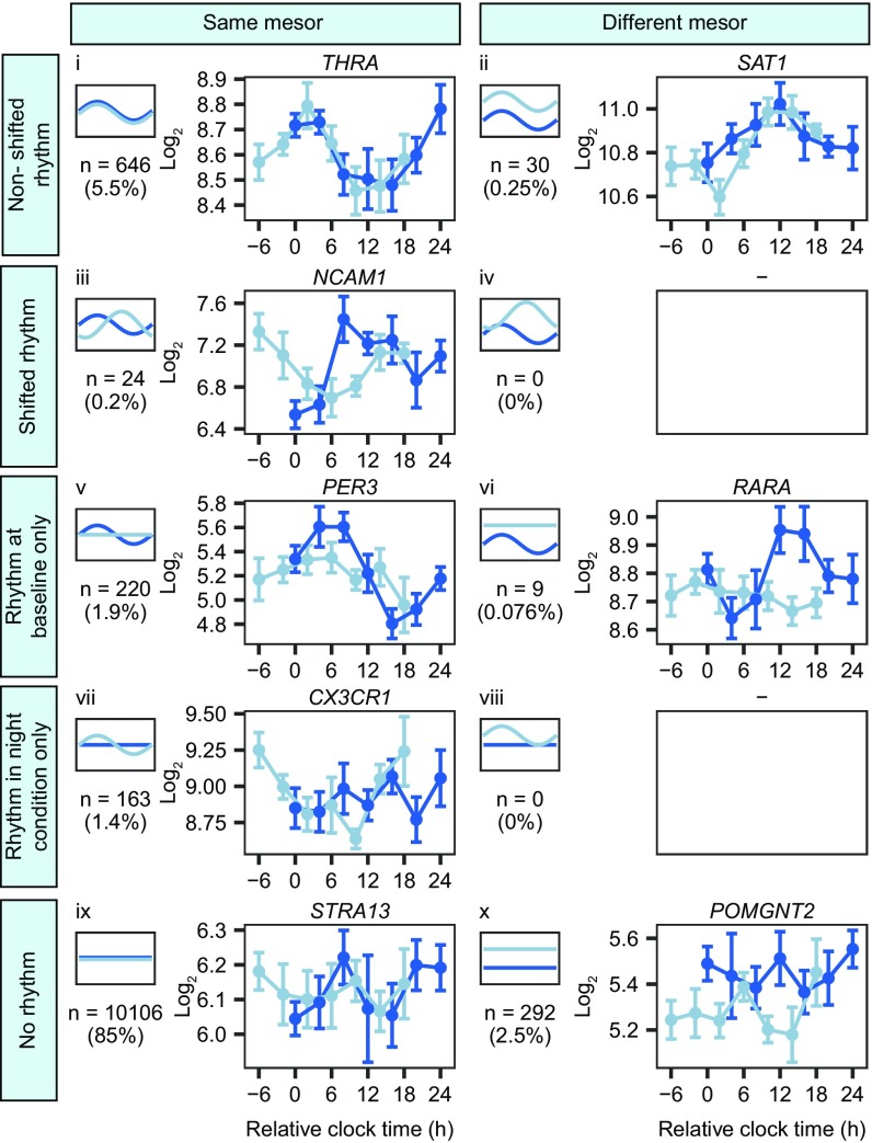
Fig. 3.
Summary of rhythmic gene expression and the effect of the simulated night shift protocol. Dark blue lines, baseline; light blue lines, night shift condition. Different panels represent different model categories. Small plots on the Left of each panel provide an example of each model category. Note that a change in mesor or a shift in rhythmicity can occur in either direction. The number represents the number of probe sets assigned to each category; the percentage represents the percentage of probe sets assigned to each category relative to all probe sets detected as expressed on the microarray. Plots on the Right of each panel show examples of the expression levels of a transcript in each category (mean ± SEM).

