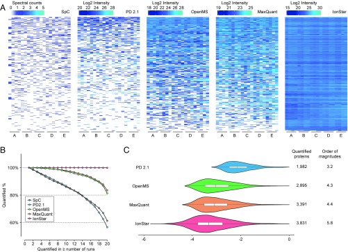
Fig. 3.
Missing data levels and quantitative intensity ranges among quantitative approaches compared in this study. (A) Abundance heat maps of proteins with the lowest 10% abundances in the benchmark sample set (n = 20 in total). White areas indicate missing data. (B) Percentage of proteins without missing data as a function of run (sample) number by different quantitative approaches. (C) Distribution of quantitative intensities (in log10 scale) for proteins without missing data by the four MS1-based quantitative approaches. The area of each violin plot is proportional to the number of quantifiable proteins (i.e., without missing data). The orders of magnitude of protein intensity ranges by all methods are labeled to the right of the plots.

